In a previous column, we introduced the total cost diagram as a simple, easy-to-use graphic to define age zones based on the time in the life of a machine when the average cost per hour, life to date, reaches a minimum. (See "Total Cost and Economic Life.") This month, we will show how the diagram can track the costs of a machine or group of machines and assist in making replacement and/or rebuild decisions.
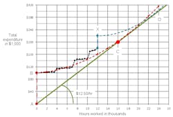
First, a brief recap. In the diagram above, the horizontal axis measures total hours worked, life to date in thousands, and the vertical axis measures total dollar expenditures on the machine, life to date in thousands. The vertical red dotted line from A to B represents the $100,000 purchase price of our example machine. The upward curving dotted red line from B on represents the estimated total expenditure on repair parts and labor and other age-dependent costs incurred as the example machine works and accumulates hours along the horizontal axis. The slope of the green line that starts at A and touches the dotted red line at C represents the minimum cost-recovery rate for the machine. By the time this machine is 16,000 hours old (point C), it will have cost $200,000: $100,000 to buy it (A to B) and $100,000 to repair and maintain it as it ages from zero to 16,000 hours (B to C). These costs are recovered at a uniform rate of $12.50 per hour ($200,000 divided by 16,000 hours) as shown by the slope of the green line.
Most importantly, the graph pinpoints the economic life or sweet spot at 16,000 hours (point C). After C, the increasing cost per hour of the machine (the red line) at any point is always greater than the minimum life-to-date cost per hour (the green line).
For more asset management, visit the Construction Equipment Executive Institute.
Now let’s look at how the total-cost graph can track actual costs and provide special insights into the performance of the machine.
The black points and the black line represent actual data from the example machine. An actual fleet would plot data from several machines in the same rate class on the same graph so that comparisons can be made between units. Since this would add clutter to the example, this graph includes only one unit to allow us to focus on the key principles.
We see that the actual total expenditure starts at point B with a value of $100,000. There is seldom uncertainty associated with the purchase price, so estimated and actual at point B are often the same. After that, the actual line runs nearly flat as the machine ages from zero to a little short of 4,000 hours. This shows that the machine has little cost in the first 4,000 hours due, possibly, to two things: It was under warranty, and the full set of zero-hour components built into the new machine required little work in the early hours of their lives.
We know that repair-and-maintenance expenditure occurs in spurts as the machine ages and requires significant work or major component replacement at a given point in time. There is a spurt (a step in the black line) at about 4,000 hours. After that, the machine performs well for another 3,000 hours when a second and larger spurt takes place at about 7,000 hours. This puts the machine well above the estimated line. Spurts of this nature are normal and confirm the fact that the machine has received significant attention or that major components have been replaced.
A spurt, in and of itself, is not much to worry about. What is of concern is what happens after the spurt, when two critical forward-looking questions arise. First, will the rate of expenditure after the spurt flatten out so that the actual cost line can move toward and close the gap with the estimated cost line, and second, how long will it be before the next spurt occurs?
Our graph shows that the work done at 7,000 hours was effective. The line did flatten out, and the actual cost line very nearly regained the estimated cost line. This was not the case with the work done at 10,000 hours, where we see the costs after the spurt growing at least as fast as the budgeted line. There is no sign of the machine coming back to budget.
Look also at the interval between the spurts and the size of the spurts. We see the interval diminishing and the size increasing. This is absolutely not a good thing as costs will rise exponentially if both the frequency and the magnitude of the spurts increase.
The machine is exhibiting three bad characteristics. First, the frequency of the spurts is increasing: It requires significant work more often. Second, the size of the spurts in increasing: The significant work done is becoming more and more expensive. Third, expenditure after a spurt is not slowing down: The significant work done is not effective.
The question becomes what to do with this machine example. Previous expenditures are behind you, and the future looks bleak. You originally estimated that the purchase price plus the cost of repair parts and labor would come to $12.50 per hour over a 16,000-hour economic life. The machine is now 12,000 hours old. The target point at C is still 4,000 hours away, and you only have $20,000 left in your original cost budget. This means that the machine will have to run at a rate of $5 per hour to go from where you are now to the target point at C.
The slope of the black line after the last spurt at 10,000 hours clearly indicates that costs are not returning to the budgeted line and that it is unlikely the machine will achieve the target point at C. Selling the unit now would give you a rate of $15 per hour ($180,000 divided by 12,000 hours) in place of the originally estimated $12.50. That is not good, but if the rate of expenditure since the spurt at 10,000 hours is any indication of the future, then this may be the best thing to do.
It is a relatively young machine. Spending on the first two unplanned spurts brought costs back in line with the budget. It is only the last spurt that produced bad results. So we could consider performing a carefully planned rebuild in the hope of extending the life of the machine and trying to achieve the originally estimated $12.50 per hour cost over an extended life.
Spending $40,000 on a rebuild will add a $40,000 spurt to the total-cost line as represented by the vertical dotted blue line up to X. The magnitude of this spurt is not a big risk as the work can be carefully planned with remanufactured components and the like. The real risk lies in the costs likely to be experienced once the rebuilt machine is put to work. An estimate of these costs is shown by the dotted blue line running from X toward D. Notice how flat the line must run if the rebuilt machine (the dotted blue line) is ever going to regain the $12.50 budgeted line.
It certainly does not look good. The black line for the new machine went up more than $40,000 in the first 8,000 hours of its life while the dotted blue line, the estimated cost of the rebuilt machine, goes up less than $40,000 as the rebuilt machine works the first 8,000 hours if its life. This is highly unlikely as the rebuilt machine will certainly not benefit from the positive impact that warranties and a full set of brand new components provided in the initial performance of the machine. The rebuild appears to be an extremely risky venture.
Managing equipment cost, and particularly the rebuild decision, is extraordinarily complex. Most costs, and particularly those associated with significant expenditures on repairs and rebuilds, occur in spurts. It is impossible to presume that things will run smoothly or that tomorrow will be like yesterday. It is critical to manage the magnitude and timing of spurts in expenditure, but this is not enough. The key to success lies in making sure that work done now reduces future costs. We spend too much time fussing about cost and in trying to reduce the cost of a particular repair or rebuild. We spend too little time making sure that we produce the quality of work needed to achieve better reliability and cost performance in the future. The work we do is an investment in the future of the machine.


