A small book titled “Fundamentals of Earthmoving” published by Caterpillar in 1968 has a special place in my bookshelf. This is what it says about repair parts and labor:
“Hourly repair costs for a single machine normally follow an upward stair step pattern since major outlays for repairs usually come in spurts. However, when broad averages are considered, the stair step becomes a smooth upward curve. Since the hourly repair cost curve starts low and gradually rises over the life of the machine, hourly operating costs must either be constantly adjusted or an average repair cost used that provides a straight line hourly operating cost. Most owners prefer the average method.
Since repair costs are low initially and rise gradually, averaging them produces extra funds at first that are reserved to cover higher costs experienced later.”
The most interesting thing about this paragraph is that the exact same words can be found in the appropriate section of the current Cat Performance Handbook. It is as true today as it was when it was written close to 50 years ago.
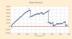
Let’s look at some numbers from an actual machine to understand what the paragraph says and learn about the idea of measuring performance and tracking life by calculating a repair reserve. We’ve plotted these machine data in the nearby graphs.
The graph at the bottom of this article plots the hourly repair costs for the machine. These are determined by calculating the total amount spent, life to date, on repair parts and labor and dividing it by the total number of hours worked, life to date. The “upward stair step pattern” is apparent as is the fact that “the hourly repair cost curve starts low and gradually rises over the life of the machine.” The upward stair step pattern is not necessarily a bad thing as the increase in repair parts and labor costs may be more than offset by a reduction in owning cost arising from the increasing number of hours worked. The graph does not, and cannot, tell us where the “sweet spot” life falls: We will need to do a bit more analysis to know when the rising stair step curve signals the end of the machine’s economic life. The graph for this typical single machine confirms that hourly repair costs do increase in an upward stair step pattern.
The repair reserve for a machine is calculated by crediting the unit with an estimated average hourly repair cost budget for each hour that it works, then deducting the actual repair costs experienced from the budgeted amount. The graph at the top plots the repair reserve for our machine based on an average repair cost budget of $10.50 per hour.
It clearly shows how the repair reserve for this typical single machine goes up and down as the machine ages and hours worked life to date increases.
The three phases in the life of the machine are again apparent, and the differences are clear and striking. From 0 to 9,000 hours (A to B), the machine lived well within the estimated cost of $10.50 per hour and was able to save or set aside a repair reserve of close to $50,000. About $20,000 was spent at 9,000 hours on minor component replacement (B to C) after which the machine continued to work within its $10.50 budget and rebuild its repair reserve to slightly less than $50,000 at 18,000 hours (C to D). Substantial component replacement and rebuild work was done at 18,000 hours and most of the repair reserve was used up at that time (D to E). After 18,000 hours (E to F), the machine really struggled to remain within its $10.50 per hour budget and there is no question that it was a strong candidate for retirement at about 26,000 hours.
The slope of the repair-reserve line is critical. From A to B, it is steep. The new machine was living well within its $10.50 per hour budget and building its reserve at a rapid rate. The slope from C to D is flatter: The machine was living within its $10.50 budget but was not able to set aside a lot for the next “spurt” in repair spending. The slope from E to F is anything but flat. The machine was living “from paycheck to paycheck” and was unable to recreate anything that looks like a reserve. It is clear that the rebuild work done at 16,000 (D to E) did not have the desired effect of reducing future costs; from this point forward, the $10.50 budget was insufficient. The machine is clearly a candidate for replacement at the next significant event.
Many repair-reserve graphs have the shape shown in the second graph. Using an average rate—in this case $10.50 per hour—does “produce extra funds at first which are reserved to cover higher costs experienced later.” Hourly repair costs do “follow an upward stair step pattern since major outlays for repairs usually come in spurts.” The challenge is to track the reserves and know when the spurts are too frequent or too big.
I strongly recommend that you produce repair reserve graphs for single significant units in your fleet. They show when spurts occur and whether they are big or small. Most important, they show what happens after a spurt in spending. In the case of this machine, spending from B to C did not produce very good results, but at least the investment was recovered over the next 9,000 hours (9,000 to 18,000 hours). Spending from D to E produced very bad results; none of the money spent was recovered over the next 9,000 hours (18,000 to 27,000 hours).
We spend too much time tracking the magnitude of our spending and too little time measuring the results produced.
Repair reserve graphs are a good tool to help us do this.
