If a picture is worth a thousand words, then a good data graphic is worth a million numbers. They help cut through stacks and stacks of data and highlight the critical trends. Edward Tufte is the master when it comes to designing elegant graphics, and if you are in the business of converting data into actionable information then I strongly suggest you read his books and become familiar with his work.
Understanding and developing good graphics is a hot topic these days when many folk are talking about data dashboards and are trying to develop high-impact graphics that display key metrics. The speedometer or fuel gauge seen on almost every dashboard is neat, but it consumes a lot of space on a screen and does not convey a lot of information.
I often get involved with dashboard graphics for equipment management and from time to time come across some innovative ideas. Let’s share two of these and see what we can do to further the state of the art.
Cost reports with one line per unit and all the normal columns for hours, rate, revenue and cost often run to about 30 pages for a reasonable-sized fleet. If you spend an hour or so, you can dig out a lot of information. But you seldom have an hour to communicate results. It is invariably necessary to provide high-level information that gives the CEO a quick answer to the “How is it going?” question. The final cost number is, of course, critical, but you need to provide more information and communicate more clearly than you do when you simply say, “We are OK, utilization is good, and we are recovering more cost than we are spending.”
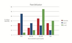
This is where graphics such as the Percent of Fleet chart help. The bar graph above is a Percent of Fleet chart focusing on utilization. The vertical axis is the percent of fleet reporting the characteristic shown on the horizontal axis. The fleet is divided into three groups: the main-line production fleet, the support-equipment fleet, and the on-road fleet. The characteristic analyzed in this instance is hours worked in the past four weeks, divided into four ranges: 0 to 60 hours, 60 to 120, 120 to 160, and more than 160. The chart gives good summary information regarding hours reported and shows that things are going well except for lots of support equipment that is either unreported or standing in the yard supporting nothing other than the fence. There is not much detail, but you are able to grasp the big picture, develop benchmark or expected values for the fleet, and take appropriate action.
This chart focuses on hours reported, and it can be restructured to focus on other important characteristics of fleet performance, such as book value to original purchase price, or actual operating costs compared to budget. All sorts of data can be presented in this format. It is simple, easy to understand, and a great way to focus on major issues at a fleet level.
The second chart we’ll share looks at a given class or category of equipment and gives insight into three critical parameters: age, utilization and cost.
The above line graph is an Age, Utilization and Cost chart for nine Z15-class excavators. The horizontal axis is their age in years, and the vertical axis is their age in hours worked. The sloping lines represent various levels of annual utilization: Green is 2,000 hours per year; blue is 1,000 hours per year; and red 600 hours per year. The diameter and color of the bubbles provides some cost information. Large red bubbles show machines that are losing a lot relative to their life-to-date (LTD) operating cost budget; large green bubbles show machines that are gaining a lot relative to their LTD operating cost budget. The shaded areas to the right and top of the chart show that we believe units should not be more than 8 years and/or 10,000 hours old.
This chart displays a lot of information. The youngest unit is clearly earning its keep. The three-year-old machine is clearly in trouble: Utilization is low, costs are high. The units around four years old are working hard, but we need to watch the costs for two of them. The two older units are showing their age and exhibiting the cost patterns we would expect. We should be planning to replace them.
Charts like this, developed for each category and class of equipment, communicate at an executive level and give the kind of information needed to make replacement and fleet-planning decisions. There is a lot of detail missing, but detail is for the folk who live the problems day to day, get down into the weeds, and work to solve the problems.
Years ago, data collection was slow and expensive. Good companies had a small quantity of high-quality data and used it judiciously to support decisions made more on intuition than analysis. Today, sensors, telematics and integrated single-entry computer databases have largely automated the data-collection process. Huge volumes of autonomously collected data flow into our systems at little cost and with little understanding of what lies behind the data. We have become data rich but information poor. Emphasis and cost must therefore focus on data analysis. We need to know what is behind the data, listen to what it is telling us, and do the analysis needed to take rational, focused, data-driven decisions.
Graphics like the two presented here will become the norm. Tools of this nature help us understand the big picture and make decisions using the optimum blend of analysis and intuition.


